Window translucency behavior is weird in Yosemite screenshots
20 Oct 2014Apple’s translucent design in OS X 10.10 (Yosemite) has some weird consequences.
My friend Adam took a screenshot of Safari running on his Mac using Cmd+Shift+4. When he sent it to me, I used my iPhone to capture some odd behavior: when I tapped the image in our Messages thread, the appearance of the screenshot changed depending on whether the background I was viewing it under was black or white. When the background was black, the Safari window completely changed in appearance.
This color-changing behavior struck both of us as weird, because Adam sent me a static screenshot. The only explanation we could come up with was that in the screenshot Adam took, OS X included some alpha channel information for the safari window itself.
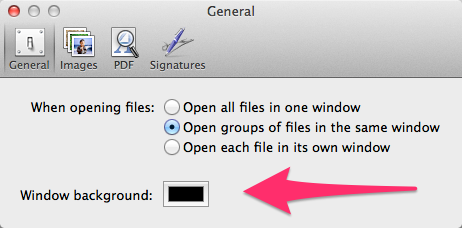
To test our guess, we both fired up Preview.app, opened the screenshot, and captured how it looked when we adjusted Preview’s “Window background” setting:

With a background set to white, the Safari window itself appears light, with well-defined delineations to visually separate tab titles. When we switched the background color to black, the Safari window darkened considerably, and tab delineations were much harder to spot. Curiously, changing the background color in Preview didn’t affect how the underlying wallpaper in the screenshot (in this case, flowers) looked at all. The background color change only affected the Safari window, which itself was in focus.

This behavior isn’t necessarily “bizarre,” though it did for awhile have me convinced of some kind of hidden voodoo when I viewed the image on my iPad.