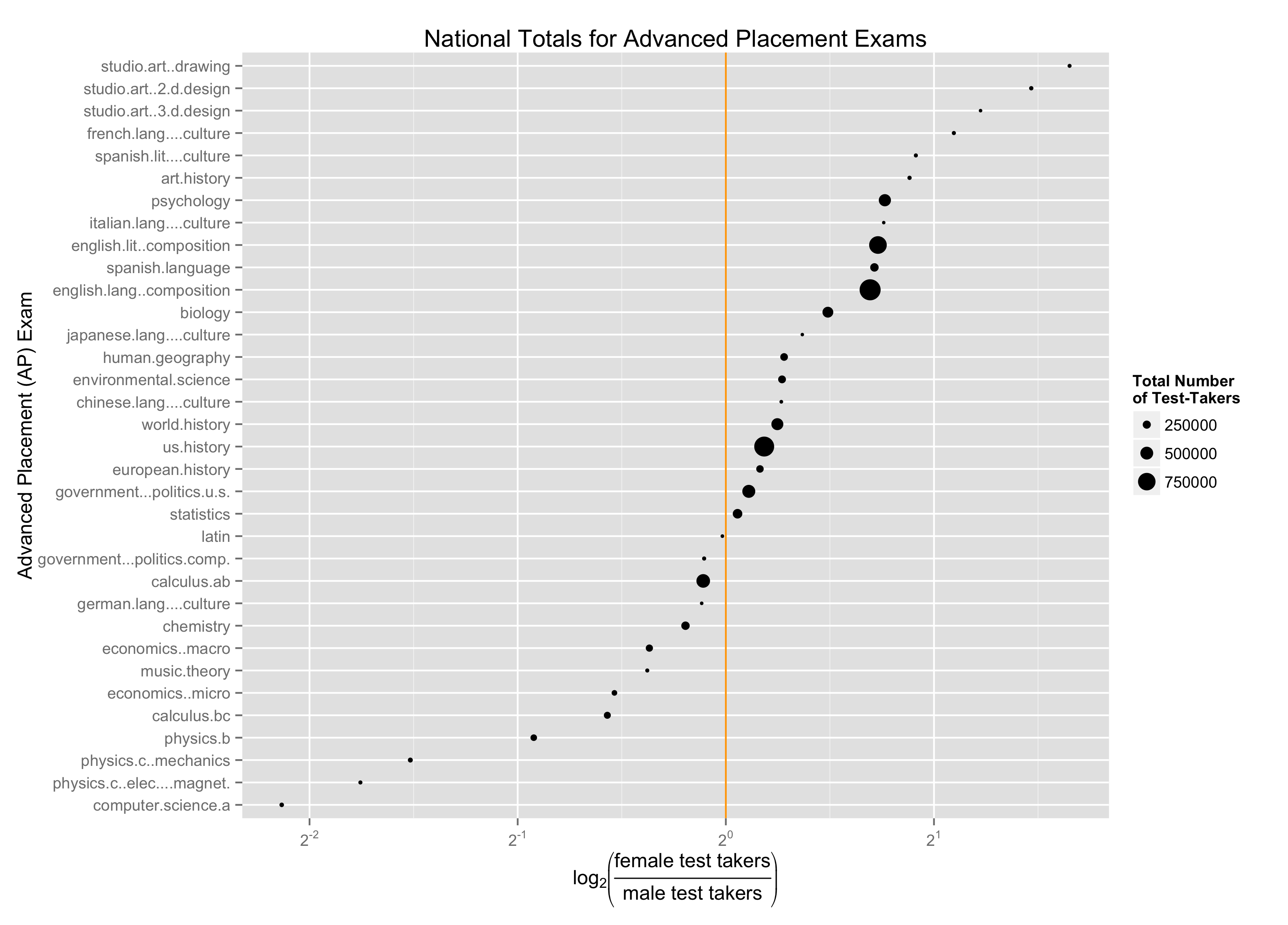
Coverage of my Advanced Placement Exam data graphic
11 Mar 2014In a previous post I took a crack at re-visualizing data from high school Advanced Placement (AP) exams. I’m interested in the dataset because of what it shows about students’ participation in science, technology, mathematics, and engineering (STEM) subjects. But, I took a particular interest in how some outlets were representing the ratios of males to females who take the exam.1
I’m thrilled to find people are circulating my revised graphic. For example, Mark Guzdial used it in a post on his blog for the Communications of the ACM. There, he noted that not only does the graphic give a better sense of the gender ratios for all exams, it also reviews the overall low participation in AP Computer Science exams, shown by their small dot size.
I’m also excited to say that my graphic will be featured on the Visions of Science Vodcast. Visions of Science is a web video series focused on how scientific images convey meaning and aid understanding. The show is made possible through the generous support of The Association for the Cooperative Advancement of Science Education (ACASE), and I hope you’ll check it out once our episode goes live!
