Creating a better data graphic for Advanced Placement exam data
31 Jan 2014The background
Danielle Kurtzleben at US News:
During the past week, tech and education writers have been talking about data showing that the gender gap in the tech world is evident even in high school.
They cite Barbara Ericson, director of computing outreach at Georgia Tech, who recently broke down the 2013 Advanced Placement exams and found that in three states (Mississippi, Montana, and Wyoming), zero girls took the AP computer science test. Even in the state where girls are best represented among computer science test-takers, Tennessee, girls only took 29 percent of the exams.
US News then went ahead and made this graph, which Mark Guzdial linked to on his blog:
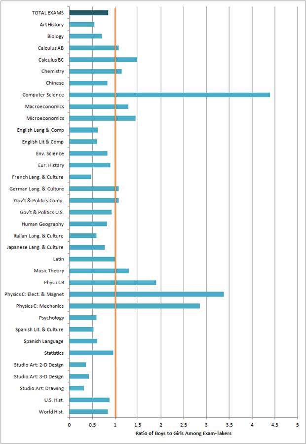
From my best read, the graph is based off of the national numbers available directly from the college board.
I think this graph has a number of great features:
- Since the TOTAL EXAMS bar at the top doesn’t break 1, we can see that there’s less than one female student taking an Advanced Placement (AP) exam for every one male student who takes one.
- The most egregious disparities where male test-takers outnumber females are in mathematics and science, because those bars are manifestly higher than the orange line which represents a 1:1 male:female ratio
- Of the math/science exams, computer science has the greatest gender disparity. More than four males took the test for every female who did.
But, I think this graph isn’t as good as it could be, and here’s why:
- There’s no useful ordering the list of exams; they’re alphabetical. This lack of ordering is a classic case of what Howard Wainer (and subsequently Andrew Gelman) call the “Alabama First” error. When there’s a chance to order data in more meaningful ways, we should.
- This is a big one to me: a ratio cannot shrink below zero, but its growth is effectively unbounded. This graph has an x-axis which goes to zero. Empirically, it’s impossible for any test that a student actually took to have a zero ratio. But there’s an even bigger problem.
- The choice of a ratio scale means that there’s far less visual space to show classes where females vastly outnumber males. In French Language and Culture, for example, females outnumber males more than 2:1. That’s a greater disparity than the gender disparity in Calculus or Physics B. The gender disparity in Art History is also nearly 2:1, which makes it a far greater disparity than the 1.5:1 we see in Microeconomics. By setting a ratio scale that goes to zero, it’s much more difficult to spot the places where females may be greatly outnumbering males, which I would argue is also a gender problem.
Making a better graph
My mentor William E. J. Doane is fond of saying you shouldn’t criticize without offering a better solution. So, with my thanks to US News and Mark for getting me thinking about this, here’s my refined graph, made with help from Angela Zoss (click to embiggen)
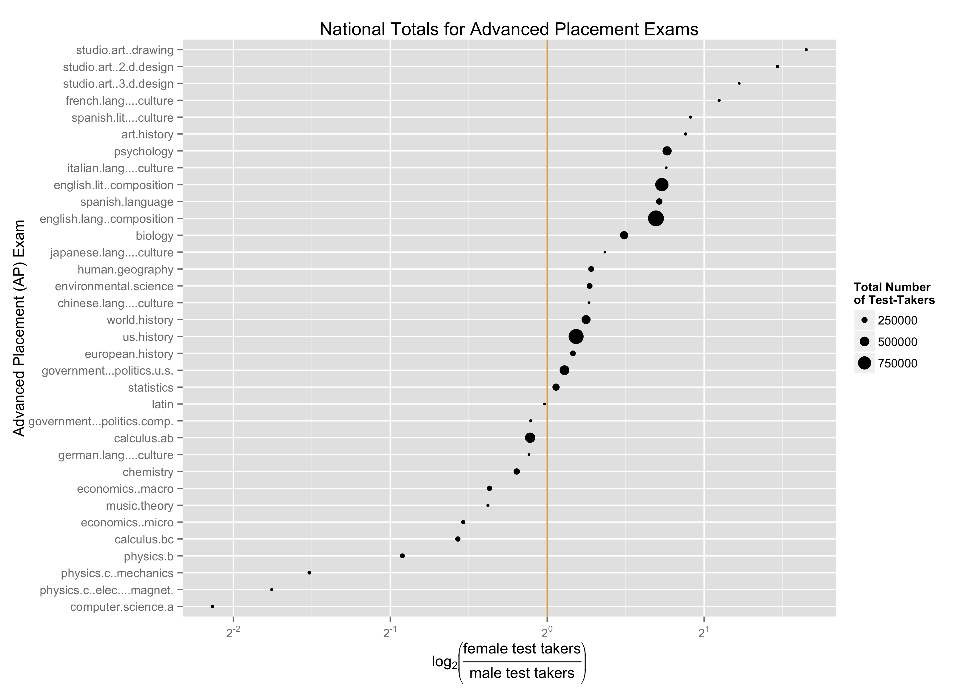
Why do I think this graph is more helpful?
- Instead of using a ratio scale, it uses a log-ratio scale. That means equal distances from the center line correspond to equal degrees of gender disparity. Computer Science A is still an extreme disparity (more than 4:1 females to males), but now we clearly see the cluster of studio art courses, all of which have a greater than 2:1 female/male ratio.
- It maps point size to total number of test takers. The disparity in computer science A is a problem, but one of the things that jumps out is that nearly three times as many students took English Language Composition, where the gender balance is decidedly skewed female rather than male. The same is true for English Literature Composition. And Psychology, which has roughly twice as many students taking it, also has more than 1.5 female test takers for every male test taker.
- Instead of alphabetical ordering, it orders by the degree of gender disparity. Computer Science and Studio Art are at the extremes. Science and math are toward the bottom. But what also stands out is the degree to which humanities-focused courses (art, romance languages) are imbalanced in favor of females, sometimes exceedingly so.
Now it’s your turn
I’ve open-sourced all of this work under an MIT license.
- Fork the repo
- Open an Issue
- Make a better graph
- Put the scalable PDF version somewhere